Pages

Thursday, May 16, 2013

picnic: A Layout for Let's Get Sketchy, May Week 2


Oh we have so much fun in the summertime! I love the color orange, and I often dress my youngest in orange, and buy scrapbooking collections with orange themes! 


 I created this layout based on the Let's Get Sketchy May Week 2 Sketch Challenge, and here is the original:

**My resolution for 2013 in the scrapbooking area of my life is to use the supplies (the stash) I have already, and to only purchase prints of photos and adhesives!**  This layout gave me lots of opportunities to look through my stash and use several pieces!  YAY! 

I used Fancy Pants Trick or Treat, Oct 31, and It's The Little Things collections, Reminisce Safety First, Simple Stories Summer Fun, Scenic Route Grafton Beach, Graphic 45 Staples alpha stickers,Sandylion Essentials Stickers, Crate Paper Toy Box Phrases, Jillibean Soup, American Crafts ribbon, Flair buttons, and Remarks Accents, and Recollections flowers!  (I also used several buttons from my stash!) Yahoo! 

Make Your Mark: A Layout for Sketches in Thyme #110


We start training in creativity and color theory early around here!  These pics show my youngest using his first set of markers. 

Using Sketch #110 from Sketches in Thyme, this layout was easy-breezy!  Here is the original sketch I worked from:
I was pretty challenged by the amount of white space in this sketch, and I really held back with my patterned paper habit! I got to use some fun paper scraps from Echo Park Little Boy, Close To My Heart, Bazzill Basics cardstock, Basic Grey brads, and a Fiskars punch!
Happy Scrapping! 

Onward: A Layout for My Scraps and More Sketches #28


I had such fun with this layout sketch, these papers, and these photos!  To me, this photo says, "FUN!"

I created this sketch for My Scraps and More Sketches #28 challenge, and here is the original sketch:

I gor to use some of my favorite papers from Echo Park, Little Boy Collection.  Some of these were scraps, and I am so happy to have used them!  I also used some fun glittery American Crafts thickers, Bazzill Basics textured cardstock, My Mind's Eye tiny orange dots paper, and punches from Martha Stewart and Fiskars!  I cut out the large circles with my Fiskars Circle cutter.  Enjoy!

Where The Sidewalk Ends: A Layout for Bo Bunny

Where The Sidewalk Ends, by Shel Silverstein


I created this layout for the the Bo Bunny May Layout Challenge:  Use a book title in your layout.


I used the beautiful Gabrielle collection from Bo Bunny, as well as Bo Bunny Trinkets!
Enjoy!

Friday, May 10, 2013

Sweet Day: A Layout for Creative Scrappers


Oh this was a sweet summer day in 2010, exploring our own back yard, and taking in all of God's beautiful creation.
 
 
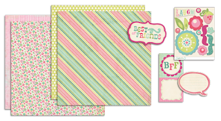
In keeping with the very difficult pledge I made for 2013, I used paper, stickers, and journaling notes from the 2010 My Mind's Eye Quite Contrary, Mary Mary collection!  Check out Creative Scrappers for some great inspiration!
 

Here is the original sketch I worked from:
I took full advantage of the opportunity to use pinks and light greens in this layout, which is a real treat, as I have all boys I also love to use my scraps of designer paper, and this sketch allowed that, too!  AWESOME! 
 
Be sure to enter my 750 Followers Giveaway by clicking HERE:

Thursday, May 9, 2013

gentle spirits: A Layout for Basic Grey Challenges and Let's Get Sketchy


Don't you just love butterflies?  I do!


I created this layout with the Basic Grey Sweet Threads collection from 2010 for Basic Grey Challenges, Challenge 93: Mix N Match.  The colors and patterns were perfect for this photo of my hubby in the butterfly bush holding a butterfly! **I also used deep purple brads from Basic Grey! Here is a pic from the Basic Grey.com site of one of the papers from the collection:
 
I based my design on the May Week 1 Sketch from Let's Get Sketchy, and here it is:
 
 
Hop over to Let's Get Sketchy, and join in the fun!
 
 
For my layout, I used Basic Grey Sweet Threads collection - from my stash - and the deep purple brads are from Basic Grey, too!  I also used papers from My Mind's Eye Lime Twist collection, Making Memories journaling note,Momenta font stickers, and a Sakura gel pen.  The butterflies were punched with a Martha Stewart punch, and the metal vintage butterfly is from Bo Bunny. 
 

Wednesday, May 8, 2013

Nature Boy: A Layout for My Minds Eye and My Scraps and More

One beautiful day in May, 2010, I photographed my sweet nature boy enjoying God's creation!


At the time, he was turning 2.  Now, 3 years later, he still loves the outdoors.  For those of us who live where cold weather and lots of rain last 8 months of the year, a gorgeous May day like this was truly a gift!
 
I created this layout for the May Day challenge at My Mind's Eye, and the My Scraps and More Sketch #27. 
 
 
And in keeping with my pledge for 2013 to use the supplies I alread have, I pulled out the My Mind's Eye Quite Contrary Mary Mary collection from 2010!


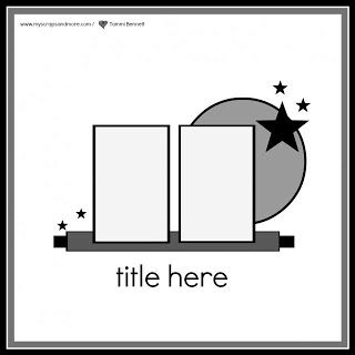
I placed the elements of my layout by following the sketch from My Scraps and More Sketches.  Here it is:
 
 
Enjoy!!