Pages

Sunday, April 28, 2013

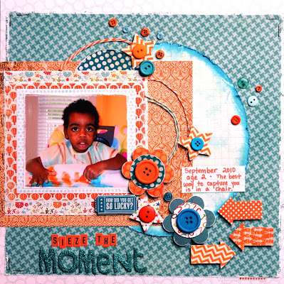
Sieze the Moment: A Layout for Creative Scrappers & Bird is The Word


Here is the original sketch from Creative Scrappers April Sketch Challenge:


I used the word "moment" in my title and will enter my layout in the Bird is The Word Challenge


I had a great time with this sketch and packing in as many embellishments and little details that I could!  I have may have gone over the edge of creativity into tacky!  You be the judge!

I used My Mind's Eye(paper, baker's twine), 7 Gypsies(paper), American Crafts(title), Martha Stewart(punch and glue pen), Marcy Uchida(punch),Fiskars(punch), Quick Quotes(ink pad), and October Afternoon(title stickers) products and supplies! (I have no idea all the companies that made the various buttons I used.)

yuck!: A Layout for My Mind's Eye Sketch Challenge for April


This is my layout for the April Sketch Challenge at My Mind's Eye!

Here is the original sketch I worked from:


I loved working with this sketch because I was able to use SO MANY patterned papers in 4 collections of My Mind's Eye products!  I was also able to use several scraps from other projects.  I used My Mind's Eye Follow Your Heart: Be Amazing and My Mind's Eye Follow Your Heart: Be Happy  And probably my all time favorite collection, Lime Twist, can be found in lots of places on my layout.

In addition, I was inspired by the whimsical thread that Ronda added to the top of her photo, and I decided to try my hand at gluing baker's twine to my project from the Lime Twist and Follow Your Heart collections.  I was so pleased with how it turned out!
 
I used a Martha Stewart liquid glue pen to draw my design, and just tapped the twine down!

The largest banner of tiny print white polka dots on orange is from the 6 x 6 pad of the On the Bright Side: One collection, as are the small banner strips of brown sketched hearts and tiny floral print.
 
I used a white gel journaling pen from Marvy Uchida to tie in the white in my patterned papers, and in the graph lines of my background pattern. 

I love buttons, and I used 2 of the decorative buttons from the Follow Your Heart accessories, and various others from my large button stash.  And last, my title is from American Crafts thickers!
 
Enjoy! 

Friday, April 26, 2013

paint: A Layout for April Week #4 for Let's Get Sketchy


My Little Bug loves to put everything in his mouth.  He decided to taste the fingerpaints, smell them, rub them on his face, and even managed to do some painting!

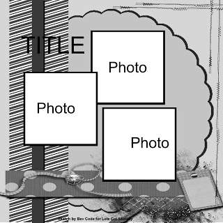
Here is the original sketch from Let's Get Sketchy:

 
I was able to pack a lot of details into this layout, and 3 photos of my little painter!

UPDATE - fam: A Layout for Sketches in Thyme #108


I'm so excited to have been chosen one of the TOP 3! 
My take on the sketch provided is actually one of my more clean & simple layouts. 


I enjoyed the challenge of this sketch, and the simplicity of the elements!  I wish all of my layouts came together this easily, used 3 photos, and supplies I had on hand!

Go Apps: A Layout for My Scraps and More # 25


Go Apps!  This is my Alma Mater, and the major school in our hometown!  Going to lots of home games has become a family tradition!


Here is the original sketch from My Scraps and More #25:
 

I loved using 3 photos and lots of paper strips and ribbon from my stash!  I also used pices of a partial leftover die-cut from Pink Paislee from another project! 

Happy Day: A Layout for My Scraps and More #24


This was a Happy Day!  Buddies from 4 families came together to play while we celebrated one mom's birthday!
 
Here is the original sketch posted on My Scraps and More for #24:

I loved using 2 photos and so many strips of paper!  All the strips of paper were scraps I had trimmed off of other projects!  I love to use scraps!  I also used 2 acetate overlays in this layout, which are typically a challenge for me to incorporate!
The Happy Day title was actually an intact strip in the Simple Stories collection, but I cut each letter apart, and trimmed them down to fit better. 
Enjoy!

Tuesday, April 23, 2013

9 '10: A Layout for Scrapping Everyday Miracles Sketch Challenge


Here is the original sketch from Scrapping Everyday Miracles:


I had a great time with this sketch and being challenged to use WASHI tape!  I used several short strips of a light blue Washi tape from SEI!  I used some old flowers, thickers from my stash, October Afternoon font stickers, and ribbons from my stash!

friend: A Layout for Let's Get Sketchy April Week 3


And here is the original sketch for April Week 3 at Let's Get Sketchy:

 
I didn't exactly follow the sketch, buit flipped it to work with the paper I had in my stash, and cut apart a die-cut to give the illusion of circular movement!  I was able to use some My Mind's Eye Miss Caroline collection, an old die-cut, and some brads from  my stash!  I love using 3 photographs, too!

Game Day: A Layout for Week 2 at Let's Get Sketchy


I used papers from several collections to complete this layout, and I love to use my stash!  I used Me and My Big Ideas, Close To My Heart brads and arrow pic anchors, and Bo Bunny.

Small Victory: A Layout for Sketch #23 My Scraps and More Sketches


And here is the original sketch from My Scraps and More Sketches #23
 
 
This sketch was a real challenge for me!  There were so many elements I wanted to use from the Simple Stories line, that it became not so simple!  LOL!
  I also used lots of buttons from my stash, 2 types of ribbon from my stash, and red foil letters from Me and My Big Ideas that I have had for a while! The photos are actually inside pockets from the
SN@P product.

Saturday, April 13, 2013

giggle & grin: A Layout for My Scraps and More Sketches #22


Oh how I love this layout!  I was able to step out of my comfort zone with this sketch from My Scraps and More Sketches #22 by using only 2 pieces of paper!  I typically use lots of patterned papers, lots of layers, and it was a challenge to limit myself to distressing the photo edges to add interest and depth!
Here is the original sketch:

 
6 photos!  I was able to use 6 photos!  Yahoo!  I also stuck to my goal of using my stash, including some Adorn It by Carolee!

36.5: April Week #1 For Let's Get Sketchy


The April Week #1 Sketch at Let's Get Sketchy allowed me to use 3 photos of my huge collection!
Here is the original sketch:
As I've mentioned in other posts this year, I am committed to the goal of using the stash of supplies and product and I have, and only purchasing adhesives and prints of pics!  On this layout, I was able to pull out one of my favorite stacks from Me and My Big Ideas!  It had the exact shade of golden-yellow-orange my son was wearing!